UX-Case study
(April-May 2024)
Mapping users motivations for the app Kron. by Storebrand
Kron. is a fund-investment app by one of Norways largest banks for savings and insurances, Storebrand. The main user-group are younger investors, and first-time savers. In this project, we got the challenge of increasing motivation within the target users to use the app more frequently (at least one time each week).

Table of content:
Empathise
Define
Ideate
Prototype and wireframing
Usability testing
Usability testing II
Summary
Team:
Johanna Martinsen
Jenny Vedal
Kamila Sýkorová
Maren Gulliksen
Tools:
Miro
Figjam
Figma
Canva
Wacom
My role:
UX Designer
Researcher
Interviewer
Workshop facilitator
Information- architecture Diagrams
Sketching
Wireframing
High fidelity-prototyping
Usability testing 1 & 2
Report analysis
Recommendations
The Design system
iPad Mockups
Timeline:
6 weeks
The design thinking process
As a designer, I follow a process to build a strong base for my work. I use this same process in my case studies in this portfolio.

Research and insight
Do research to understand our users and their needs.

Define
Define who our users are, their needs, goals, and pain-points

Ideation and planning
Create innovative solutions based on the primary assumption, persona, and problem statement from the define stage.

Prototyping
Sketch top solutions and create low-fidelity wireframes.

Usability testing
Test our top solutions with moderate in-person lab testing.
Kron.
Kron is an app created to motivate younger individuals with a relaxed attitude toward finance, to gain more knowledge, and save more frequently.
Kron has established a dedicated investment account, which is very inexpensive.

Empathize
Research goals:
High-priority questions
How can we motivate and engage the younger generation to become active users of the app, with at least one visit a week?
What will make a user search for an app with a focus on savings and funds?
How can we differentiate our app compared to other similar apps?
Where do users currently find information about private finances?
Low priority questions
How do experienced users decide which company to invest in?
How and when does the user group currently save money?
What motivates the user group to invest/save money?
Methods:
Interviews
Survey
Feature analysis
Competitive analysis (SWOT)
Literature review
Key insights
During the whole research process, we found some interesting facts that all the methods used have in common...
Many users of the younger generation (like young gen-z) live in an unpredictable future, and save for the “here and now”. The users need is to have a smaller “minstebeløp”.
We recommend showing a chart that predicts how much they can save if they stick to the plan, compared to a normal savings account. The goal is motivation to save more and for longer periods.
There is a pattern (especially in the survey) that many users want more information and details about the funds they have invested in or are exploring.
A risk of the easy layout the app already has is that the users might switch over to an app more complex when they get more experienced.
Define
Primary persona
User need statement
Gary has a goal to buy his dream-car car within a year, saving on high-risk funds.
The stakes are high, and he wishes Kron could give him some more detailed assurances and motivation to make the right decision.

Vision statement
Improve the current Kron app with personalized features to increase the user’s motivation. The app would also keep users informed and updated regarding the current market and provide guidance with suggested advice.
HMW
How might we increase user engagement with Kron app?
How might we personalize features to the user based on individual preferences?
How might we increase interest of the users so they become advanced funders?
The four W’s
By adressing the Four W’s we can create solutions that are user oriented, effective and meeting users’ needs.

Who is the target audience?
Money-councious people wanting to make better choices.
The app should target on broad audience regardless their starting knowledge within finance.
Why is the app important to the young population?
Keep and increase financial literacy among young generation.
Attract their attention towards smart management of their money.
What problem can it solve?
The app can open possibilities to become a funder to everyone.
It can increase interest among beginner within funds and gain young people’s attention towards funds and finance.
When the users need to get motivated?
Increase motivation within young users with less knowledge.
We need to increase motivation for users when the numbers not looking promising and they may get scared.
Ideation
Ideation workshop
We used brainwriting and NUF-test techniques in our ideation workshops and prioritized the data in a MoScoW sheet.

First sketches of top ideas


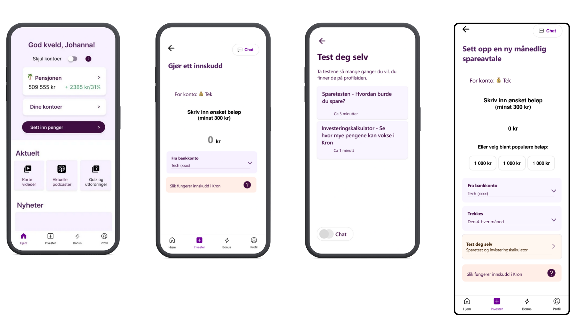
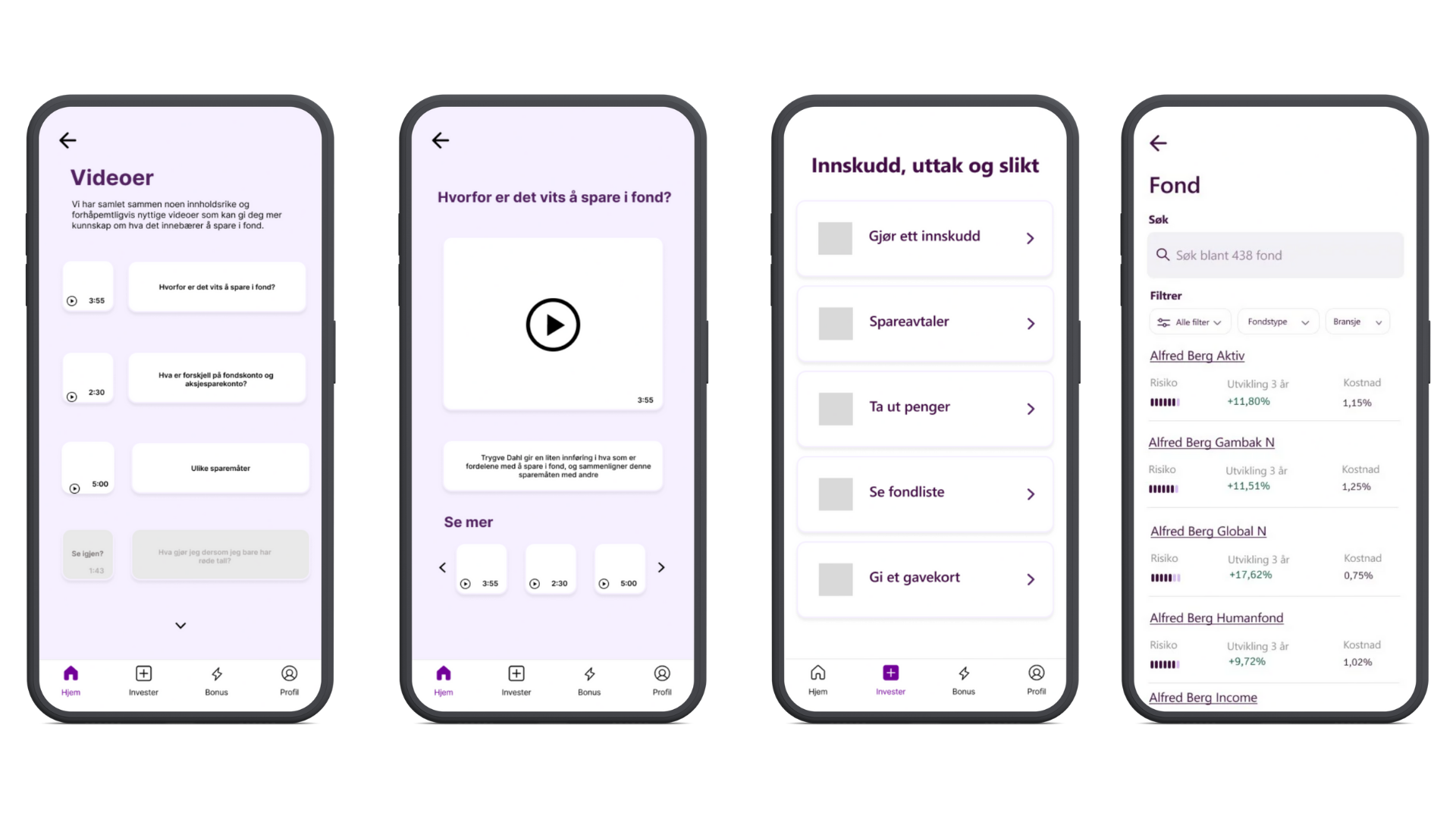
The video- and podcast pages are added based on the SWOT analysis of Nordnet and surveys. These are personalized based on the user’s knowledge and can be changed on the profile page. Here, the user can also change preferred language.
The Fondlist (Fondliste) moved to the Investment (invester)-page to fit the user’s mental model. This was based on assumption and was tested and proved on the first usability test.
Aktuelt- and børsmelding are on the investment page but were changed later in the process.
Prototyping
Information architecture 1
Before we created the mid-fidelity prototype ready for the first usability test, I made an information architecture diagram of the app. I used the downward technique as a personal preference.

User flow
User flow describes how users navigate through the app to do the specific task. The tasks illustrated will be relevant in usability testing 1.


Task flow
Showcase specific tasks for usability testing 1.
Mid-fidelity prototype


High-fidelity prototype
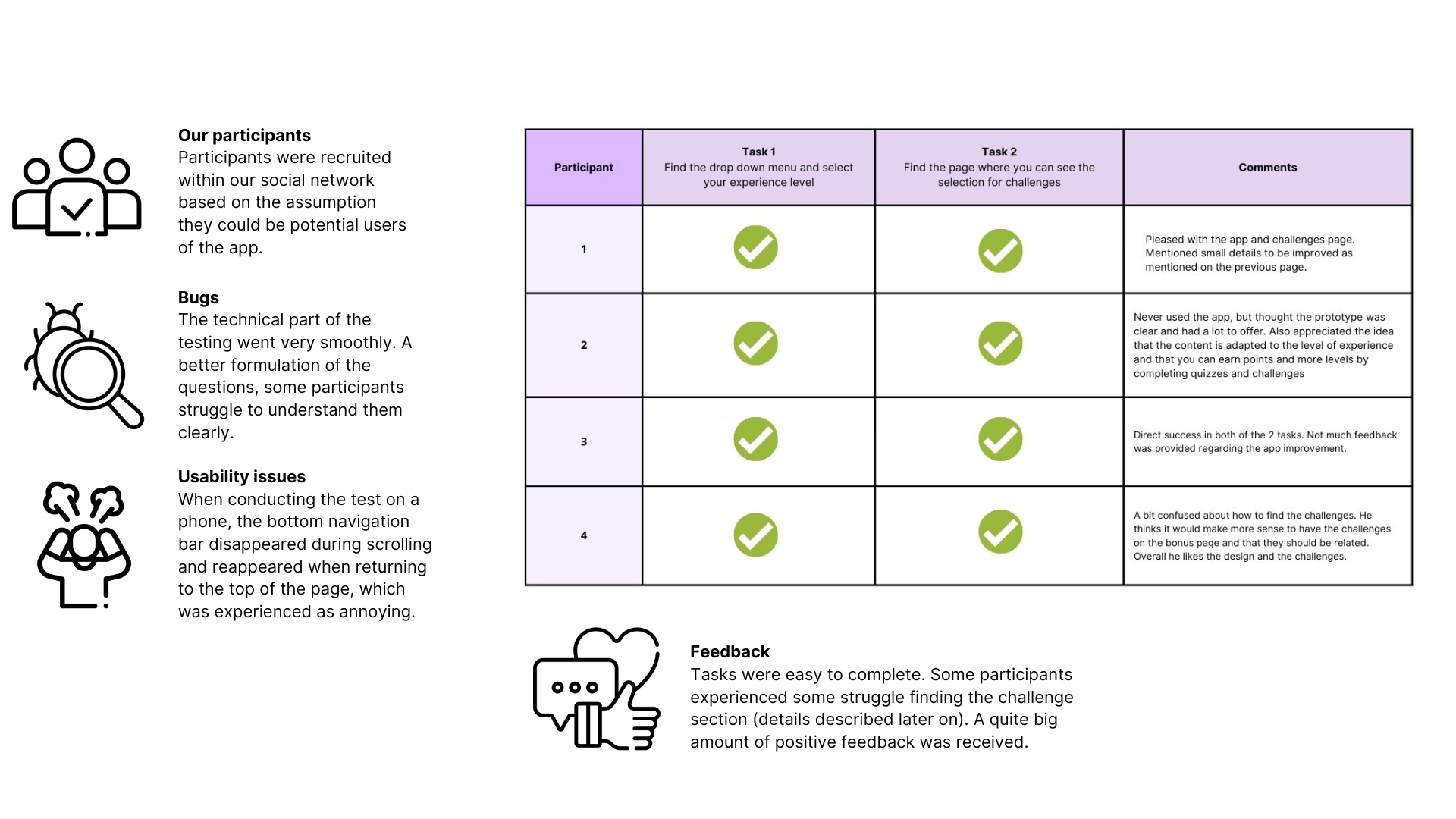
Usability test 1
About the test
To implement usability testing, we prepared the scripts, selected test types, thought about the recruitment process, incentives, metrics to be tracked, selection of software, etc.

The metrics for the testing phase were established as follows:
Completion rate: direct success, indirect success, failure
Competition time
Error rates
Satisfaction ratings
Four participants were recruited for our project.
We conducted a moderated remote usability test to get the most information possible from the participant's total experience and their impressions.
A formative usability test was conducted, as we hoped to get a good amount of qualitative data and see how users navigate within the app when completing a specific task, ask additional questions if needed, or clarify any misunderstanding.
Task flow
The following task flows were asked to be completed during testing:

Test results
We gathered our data and made a usability test-report.
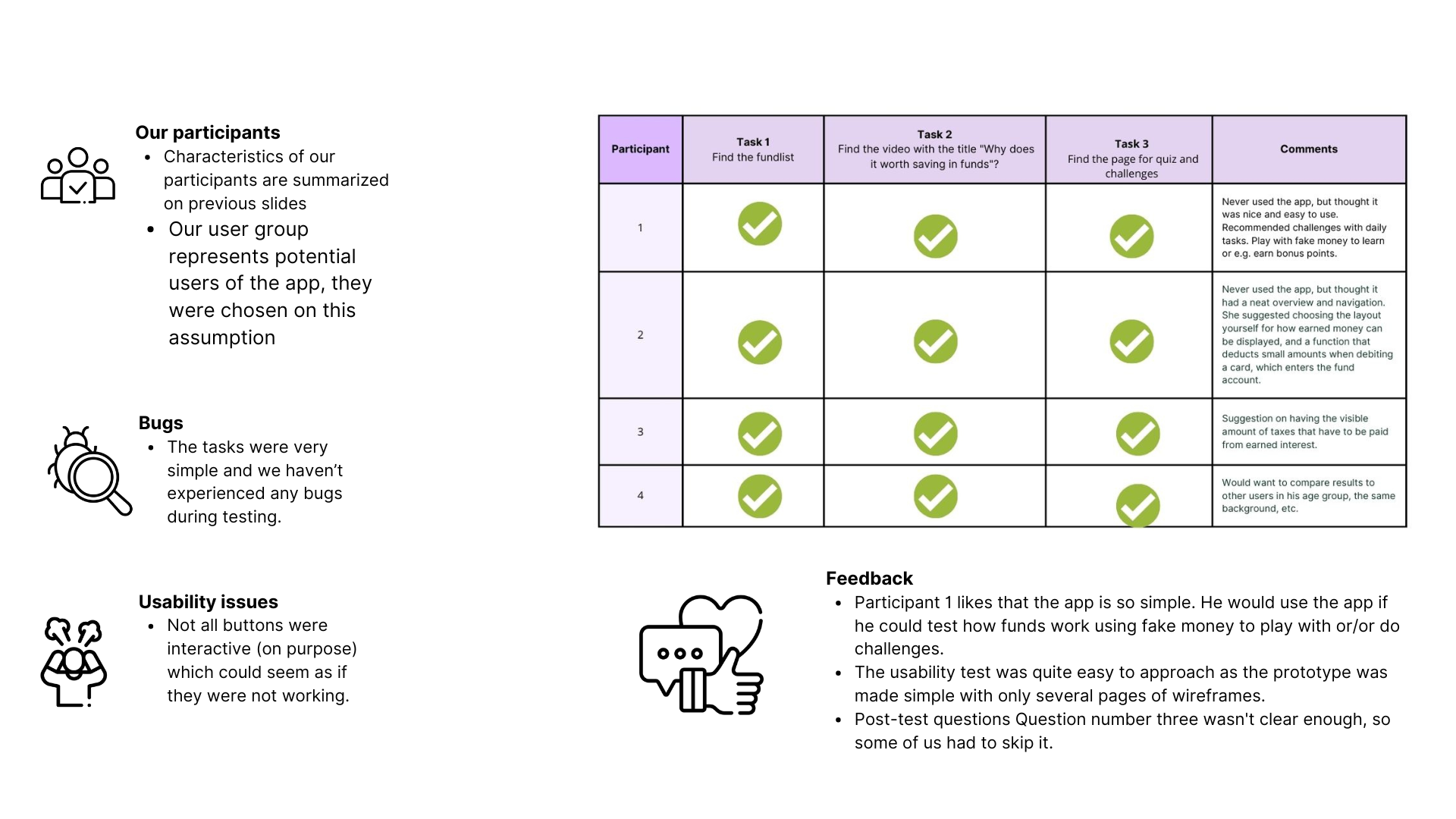
Improvement recommendations
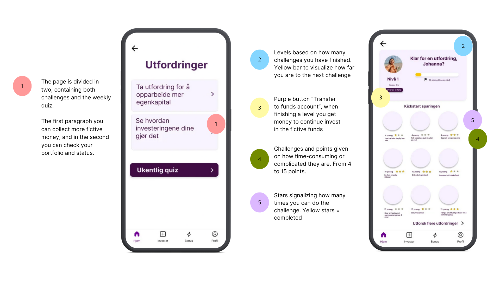
Based on feedback from our participants and feedback received from Kron company we came up with the following suggestions related to developing the challenge section.
Prototype improvements
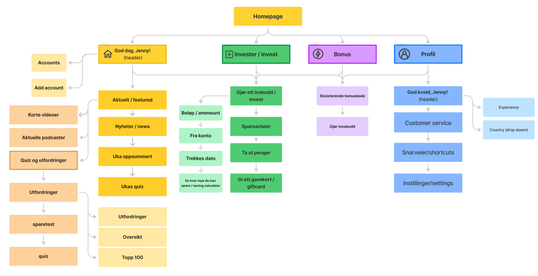
Information architecture 2
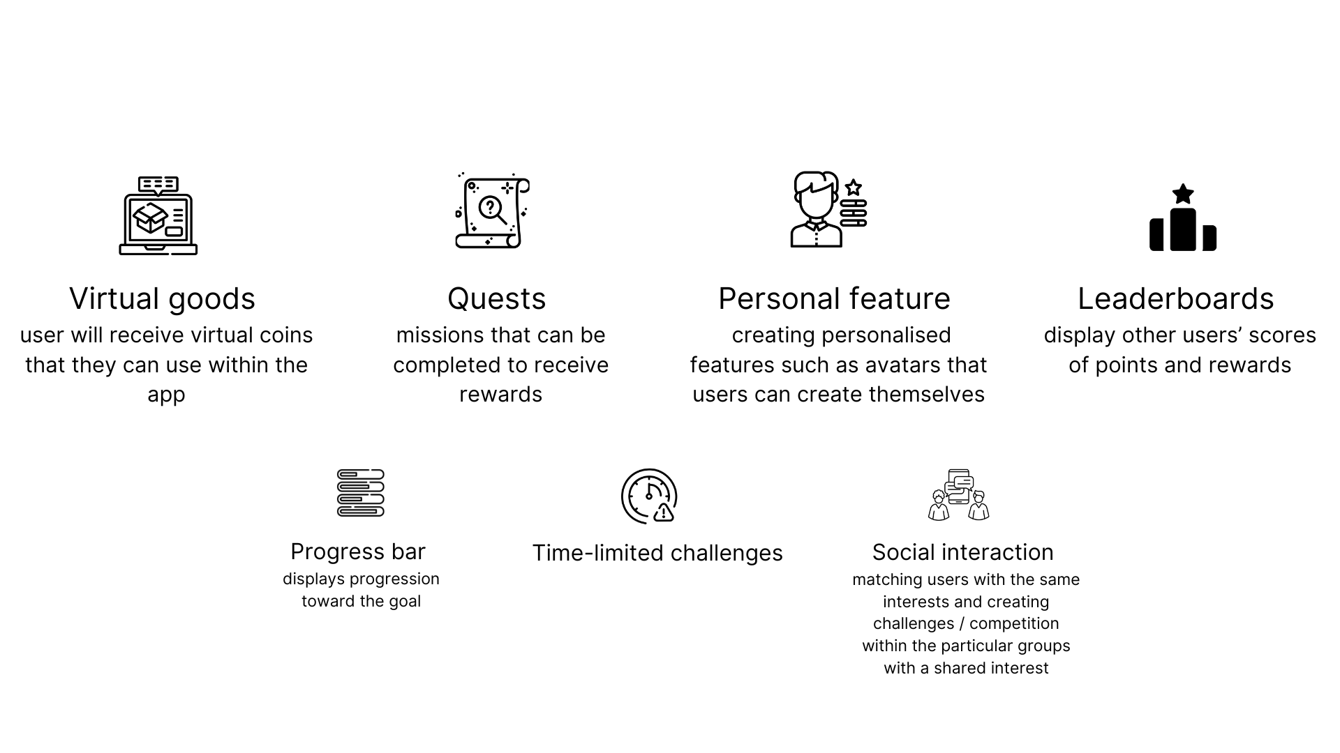
Gamification
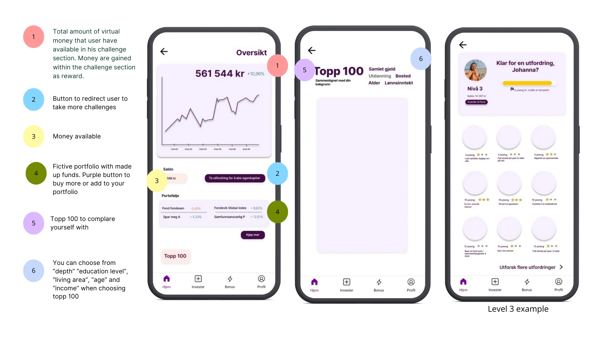
As our test subject wanted a way to learn more about fund-saving in a fun way, we added gamification as motivation to do so. The game consist different challenges to do each week, and users get achievements, leveling, and awards such as gift-cards to use in the app. To increase even more motivation, we later came up with the idea of having a top 100 list. Check out the comments for more details!
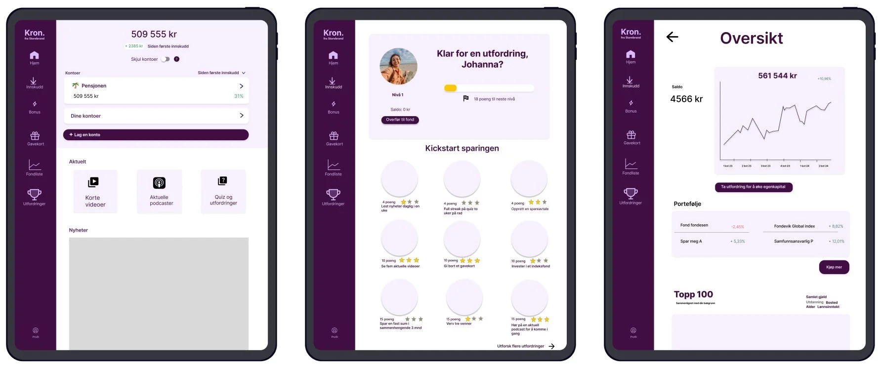
iPad mockup
I made a quick mock-up to get an idea of how the changes would look like on the iPad version of the app.
Design system
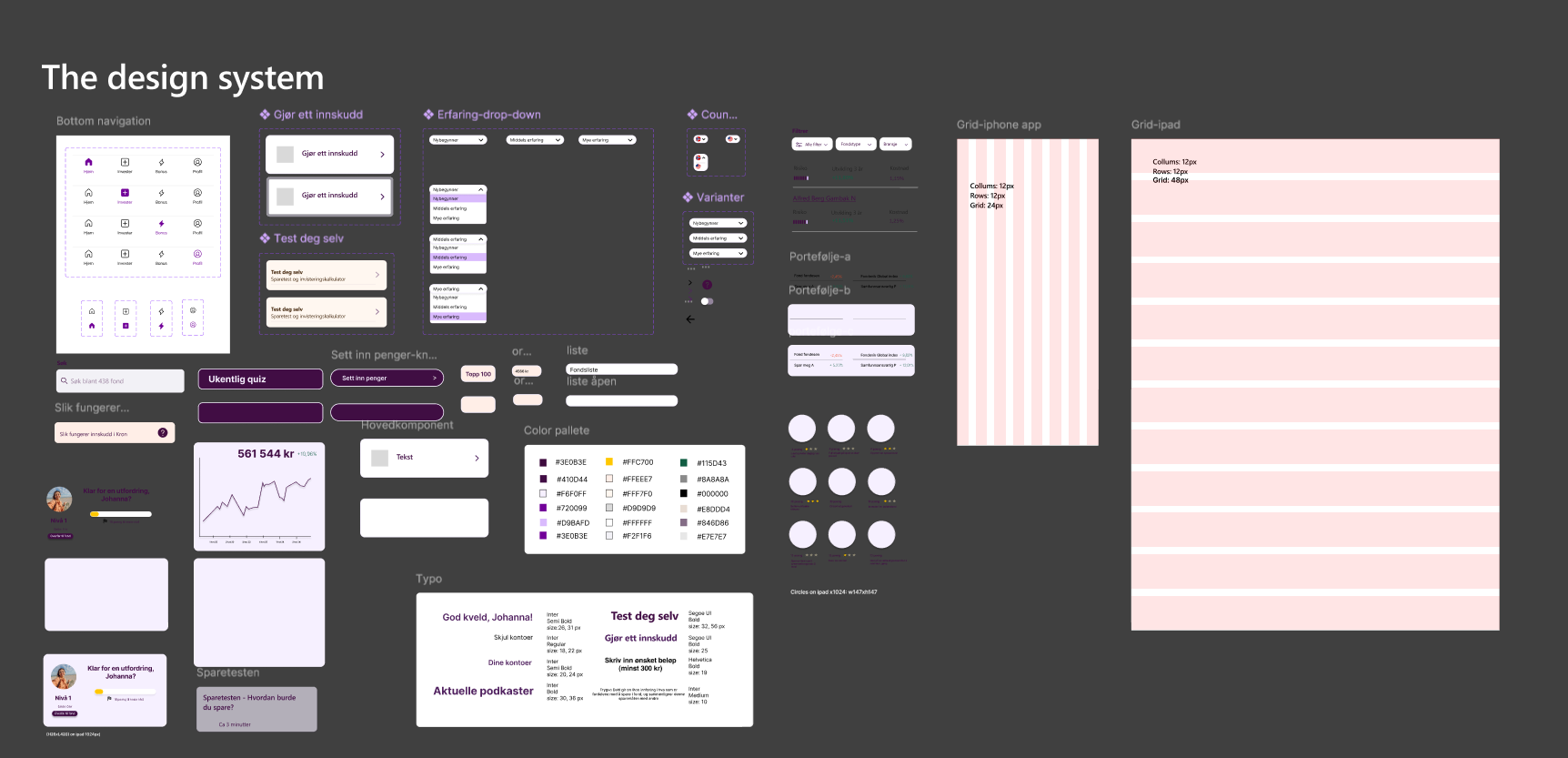
To reach systematic and smooth work I created a design system and functional components.
The design system represents a library of developed tools and components that have been used during our working process. I also made the components easily accessible on the assets menu in Figma.
Usability test 2
Following task flows were asked to be completed during testing:

Test report
Feedback recommendations

As our project came to an end, the case study and recommendations were finally presented and well-welcomed by over 20 employees and developers at Storebrand’s main office in Oslo. We are grateful for the unique challenges and opportunities provided by the Kron team at Storebrand ASA.
Thank you reader for taking your time to go through this casestudy:)
The End
Hire me